
D.P. Dough Mobile App Remake

My goal during this project was to remake D.P. Dough's mobile app, since I believe its User Interface and User Experience require a redesign. The restaurant is a fast food chain that mainly serves college students across the US. I will now show how my design thinking lead me to the following results using the Figma program, which excels at prototyping apps and websites. At the end of this presentation there is a link to my Figma project.

Here is one of the main problems with the current app: it does not have a homepage. At least not a solid one that shows the user things like the menu or account options if logged in. The photo attached above is a screenshot of the very first thing users see when entering the current app.

Since the hompage is such an important asset to every app, I started by creating a low lite redesign of it. On the center of the page, there are three buttons that can take the user to the menu, deals section, and schedules of the store. All of these possibilities are likely the first information college students want to see when entering the app, therefore it is efficient to have them displayed in the homepage.
There is also a bar at the top that showcases the restaurant's logo in the middle, and a shopping cart button on the right side. At the bottom, there are four buttons that represent the homepage, the menu page, the delivery page, and the information page. I also added a "Select Location" page so users can select a store and look at its hours.
Here are some low lite prototypes of these pages.


Once I had the main UI pages settled down, I started creating the high lite versions in order to work on the UX and start defining the app's own identity. This meant choosing the color palette and typography. I also started creating the icons myself, since the ones in the low lite versions were taken from the internet.
For the palette, I decided to go with a combination of black, light grey, dark red, and yellow, since these are the colors the current app uses. I did change the red to a darker tone, but other than that there was no need to make any changes, since the main problem with the app was the UI.

As for the typography, I decided to go with the "Inika" typeface for the bigger, flashier texts, using the bold version for some titles. This typeface works well because it fits into the old school aesthetic the brand portrays. As for smaller texts, I used "Iconsolata", since it is way less attractive to the eye, but makes text more legible and clear.

Here are the high lite versions, the ones that make use of these color palettes and typefaces, of the previously shown pages (homepage, menu and ordering, delivery and catering, information, select location).


One major difference between the low and high lite versions of these pages is the addition of the "Account" symbol in the top right corner of the high lite pages. This was an important aspect to include, since it would give space to another feature I wanted to add, which is the rewards system.


The page on the left, the account page, allows the user to input and edit their personal information, including their name, phone number, and email address. It also allows them to access the page on the right, the rewards page, where they can see their amount of accumulated points, which are obtained through purchases, and what they can spend them on. The current D.P. Dough app already has this system, so I took it and organized it better.
Moving on to other incorportations in the high lite version, there is the new, more in-depth menu. If the user clicks on any of the icons shown, they can access pages where the several options are shown.

Here are some of these in-depth pages that showcase the variety of options available: the "Calzones" page, "Stix and Rolls" page, "Sauce Options" page, "Desserts" page, and "Deals" page.


In addition, I included a hovering feature where the user can access even more details about each option displayed on the menu. This way, users get more information and they can better decide what to order.


I also created a page that allows the user to choose the amount of items they want to add to their cart. This is followed by another page that lets the user know their items were added, and gives them the option to keep browsing on the options in case they wish to add more to their shopping cart.


Finally, I decided worked on the shopping cart symbol in the top right corner, adding features that would wrap up the user's experience by finally putting an order on their chosen items.


On the left page, the one for the shopping cart, there is a button at the top that lets the user check their saved contact and credit card information one last time before placing an order. Below this button, the saved stores and addresses are displayed along the options of picking up the food at the saved restaurant, or have it delivered to the saved address. Right below the delivery option, there is a box where users can write any special delivery instructions, if any.
On the right page, the one for the contact and credit information mentioned before, there is a number of text boxes where the users can input or change their account name, phone number, email address, and credit card information. Once they verify the information and go back to their order, they can choose the "Pickup" or "Delivery" options, which brings them to the final payment page, showcased below.


On the left page, which serves as a final review before payment, there is a button at the top that allows the user to access a split payment feature. Below this button, the order summary is displayed along the options to input a promo code or a custom tip, finally showing the total cost of the order. Next to the total cost, there is a button that lets the user finally submit their order and pay.
On the right page, the one for the split payment mentioned before, the users can create multiple profiles with different names, assigning specific items and tips from the order to each of these, summarizing the individual total costs so each profile can see their expenses. Same as the normal payment page on the left, there is a "Submit Order and Pay" button.
Since the other profiles would not have their cards saved on the account, they would have to pay physically in cash or card when going to the restaurant or receiving the delivery service.
The button, on both the normal and split payments, takes the user to a final screen, where their order is confirmed.
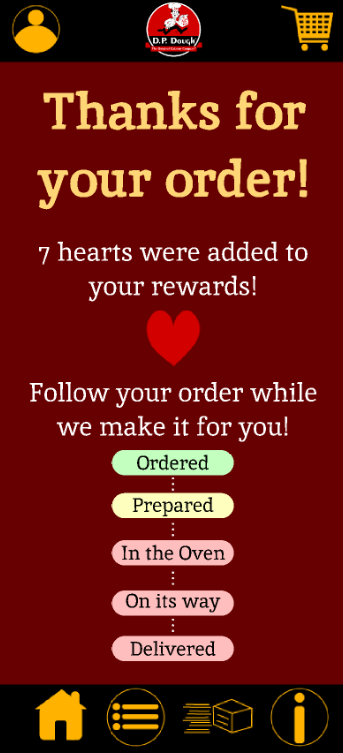
After thanking the user for their purchase and informing them about the points they obtained at the top of the page, there is a process tracker at the bottom. It shows five steps that must be completed before deliverying, assuming the user clicks on this option. The color code allows the user to know whether the step has been completed (green), is in progress (yellow), or has yet to even be started (red).
And this concludes my redesign process with D.P. Dough's mobile app. This transformation takes the app from an interface that is barely usable and is not easy to use, to a user friendly and efficient app that takes everything from the original one and improves upon it, organizing old features and adding new ones.
If you wish to try this app prototype yourself, here is the link:
Thank you for following along!


